

Designing a home is exciting, but it’s easy to fall into a few common traps that can leave a space feeling awkward or incomplete. At Meg & Co, we’ve seen it all—from furniture that’s the wrong scale to rugs that don’t quite fit, or rooms that lack a clear focal point. Even small missteps, like pushing everything against the walls or mixing too many clashing finishes, can take away from the overall flow of a home.
The good news? These interior design mistakes are easy to avoid once you know what to look for. With a little planning and an eye for balance, function, and personal style, you can create rooms that feel warm, intentional, and inviting. Today, we’re walking you through five of the most common interior design mistakes and how to avoid them, so your home looks and feels its very best.
Design a home as unique as you. Book a free consultation with Meg and start the journey.
1. Is Your Rug Too Big or Too Small?
Area rugs can completely transform a room—but only if you get the size right. One of the most common interior design mistakes is choosing a rug that doesn’t fit the space. A rug that’s too large will overwhelm the room, while one that’s too small won’t properly define the area. The key is to let the rug ground the furniture and help create zones, especially in open floor plans where you need visual boundaries.
When choosing a size, think about the zone you’re creating and how the furniture will sit on it. In a formal living room, for example, it usually works best for the rug to extend just under the front half of sofas and chairs, while the back legs rest on the floor. This creates a balanced look, keeps the furniture tied together, and gives the room a sense of cohesion.
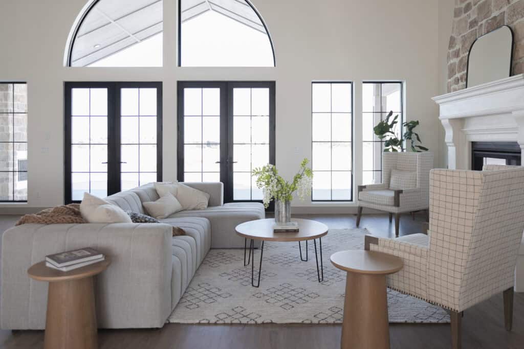
2. Placing Furniture Against Walls
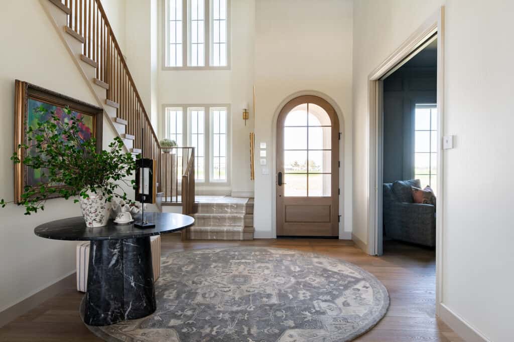
When we map out interiors, we lean on core principles like proportion, scale, balance, and symmetry to make a room feel cohesive. One of the most common interior design mistakes people make is pushing all the big furniture against the walls, which leaves an empty, awkward gap in the middle. Instead, think of furniture as pieces that should work together to create inviting groupings.
Start by considering how you actually use the room, then arrange furniture into zones that fit those needs. In a formal living room, for instance, you might create a conversation area, a spot for games, and a cozy zone for movie nights. A helpful trick is to tape out the layout on your floor before moving heavy pieces. And as you’re working with your designer, ask for renderings that show your space to scale—seeing it mapped out can make all the difference.
3. Inadequate Paint Color Selections
Choosing paint colors is one of the most impactful design decisions you’ll make—and it goes beyond just the walls. Trim plays a huge role, too. Many homeowners default to bright white for trim because it feels safe, but that isn’t always the best decision.
Another approach is to pick trim colors that complement your wall color or even go tone-on-tone for a more cohesive look. One exciting trend to consider is color drenching, where walls, trim, and even ceilings are all painted in the same shade. This creates a bold, unified feel and can make a room feel both modern and cozy. Whether you go with subtle contrast or full drenching, the key is to think of trim as part of your palette, not just an afterthought.

4. Size and Height of Kitchen Pendants
Kitchen pendants are one of the most important lighting choices you’ll make—they set the tone for the whole space while also providing essential task lighting. But style alone isn’t enough; placement and size matter just as much. We’ve all seen pendants that are hung too high, too low, or sized completely out of proportion, and it can throw off the entire room.
The same rules that apply to dining room lighting also work for kitchens. Over a dining table, the bottom of the fixture should sit around eye level when you’re seated—typically 30 to 36 inches above the surface. For kitchen islands, a good rule of thumb is about 32 inches above the countertop in a room with standard eight-foot ceilings. If your ceilings are higher, you can adjust upward to maintain the right balance and clearance.
It’s also important to consider scale. Oversized pendants can overwhelm a small island, while fixtures that are too small get lost in a larger kitchen. Think about the width of your island, the number of pendants, and the amount of light you actually need. And don’t forget the human element—always keep the client’s height in mind so the fixtures look great and function comfortably.

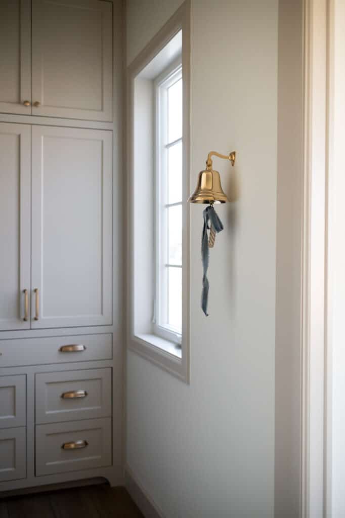
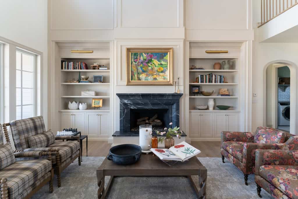
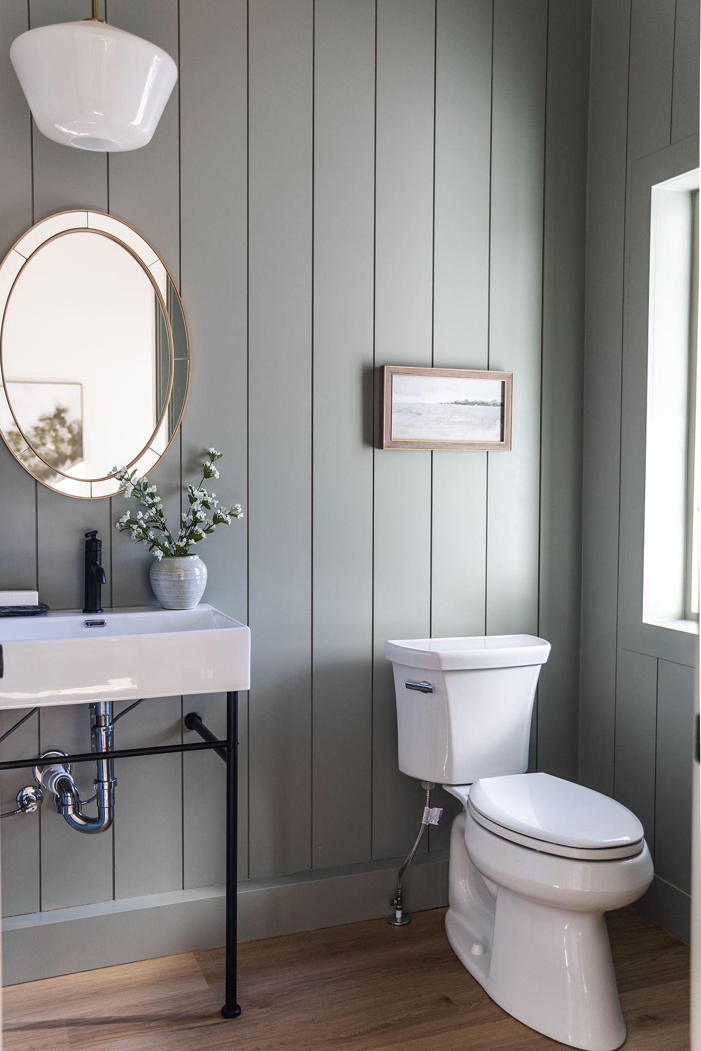
5. Scale and Placement of Art
Another common design mistake is the size and placement of art. You can have a beautiful piece, but if it’s hung too high, too low, or on the wrong scale for the wall, it loses its impact. That’s a shame, because art should elevate a space—not get lost in it.
A simple rule of thumb to follow: the center of the artwork should be about 60 inches from the floor, which is roughly eye level for most people. This keeps art feeling connected to the room rather than floating above it or dragging it down.
Scale matters, too. A tiny piece on a large, empty wall will feel underwhelming, while something too large can overpower the space. Think about balance—art should complement the architecture and furnishings, not compete with them. When in doubt, step back and look at how the piece interacts with the room as a whole.
In the end, good design is about more than just furniture and finishes—it’s about creating a home that tells your story. Paying attention to details like scale, balance, and placement ensures every room feels intentional and harmonious. The right combination of choices can transform your home into a place that’s not only beautiful but also deeply functional for everyday life.
At Meg & Co, we believe great design begins with thoughtful decisions and a clear vision. If you’re ready to create a home that feels personal, welcoming, and timeless, we’d love to walk alongside you in the process. Together, we can bring your vision to life—one well-designed space at a time.
Book A Consultation
Let's get to know each other. Contact us through our client inquiry form! We'd love to talk with you about your custom home project and get to know you better.
During an initial consultation, we will discuss the priorities you have for your home, your planned investment, and your personal style.
Book Now
More Posts

How to Design a Functional Entryway | Real Custom Home Examples by Meg & Co

Meet Our Team: Elizabeth Karel, Estimator at Meg & Co
How to Mix Finishes in the Bathroom
