
Color tells a story, and at the Charles Project, every shade was chosen with purpose. Featured in the Magic Valley Parade of Homes this past June and honored with multiple awards, this home is a showcase of thoughtful design and intentional detail. From moody cabinet tones to soft, creamy walls, each space feels distinct yet connected, thanks, in large part, to a carefully curated palette.
The Charles Parade Home featured several of the paint selections highlighted below. Projects like this don’t just inspire homeowners, they can continue generating visibility long after the event. We recently shared more about that process in a Pinterest graphic design case study featuring Meg & Co.
In this blog, we’re walking you through six best interior paint colors used throughout the home—exploring where they were used, why they work, and how they contribute to the overall feel of each space. From quiet neutrals to bold statements, these hues brought depth, warmth, and personality to every corner.
Let’s dive into the best interior paint colors that helped make this home unforgettable and see if you can pick a favorite.
Design a home as unique as you. Book a free consultation with Meg and start the journey.
1. Swiss Coffee by Benjamin Moore In The Entryway
The moment you swing open the front door of the Charles Project, you’re greeted by a truly grand entryway. Its monumental architecture and warm design create an unforgettable first impression. The main white oak staircase takes center stage, softly framed by the warm, creamy tone of Swiss Coffee by Benjamin Moore, one of the best interior paint colors for creating a welcoming look. It’s easy to see why this paint is both a best-seller and a designer favorite. Its beauty truly speaks for itself.
Swiss Coffee is not your typical white. It’s a creamy, warm-toned neutral that adds a soft elegance to any space. While it reads as a classic white, its subtle undertones bring just enough depth to keep it from feeling stark or cold. In the Charles entryway, it accentuate the natural wood tones of the staircase and allows for architectural details to shine through.
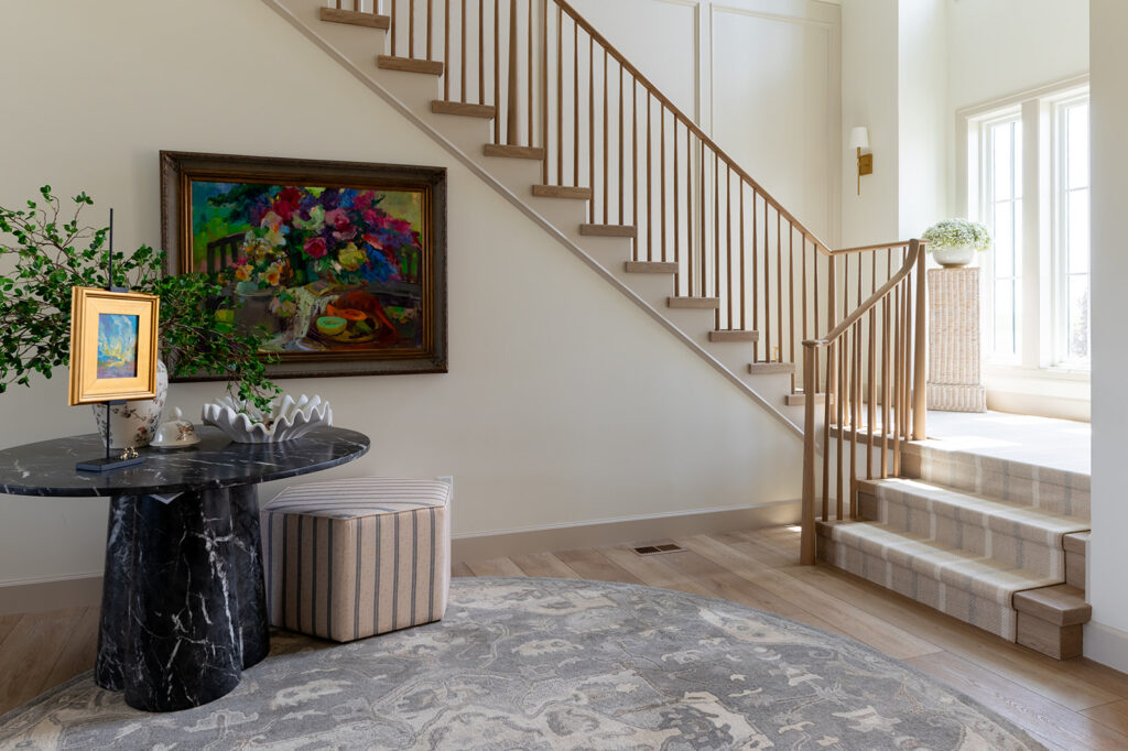
This color is rated one of the best interior paint colors for good reason: it’s versatile enough for both interiors and exteriors, and creates an inviting, light-filled atmosphere. Warm whites like Swiss Coffee can be deceptively tricky to get right—but when you do, the result is nothing short of magical.
Here, it delivers a welcoming, elevated feel—elegant and classic yet never boring. From the first step inside, Swiss Coffee proves why it’s a go-to for creating spaces that feel effortlessly beautiful.

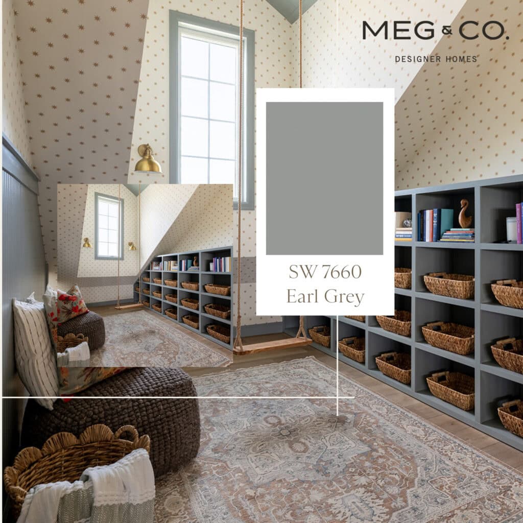
2. Earl Grey by Sherwin Williams: A Cool, Sophisticated Neutral
At our Charles Project—featured in the Magic Valley Parade of Homes this past June—we designed a whimsical little library nook that’s equal parts charm and comfort. Nestled beneath a sloped ceiling with a centered window, this tucked-away space features a custom swing, cozy textures, and built-ins that run just below eye level—perfectly scaled to the unique architecture of the room.
We chose Earl Grey by Sherwin-Williams (SW 7660) to ground the space with a rich, cool-toned grey that subtly leans into charcoal and green undertones. It’s the kind of color that instantly calms the room while adding just enough contrast to feel thoughtful and refined, easily earning its place as one of the best interior paint colors for cozy, character-filled spaces.

What makes this shade so versatile is its ability to complement both warm and cool color palettes. It plays just as well with cozy taupes and soft yellows as it does with deep greens or muted blues. For our project, we paired it with charming star dot wallpaper above the wainscoting, brushed gold wall sconces, and fully painted built-ins and paneling.
Earl Grey proves that a neutral can still make a statement—especially when used in creative, personal spaces like this one.
3. The Butler’s Pantry: Shiitake by Sherwin Williams SW 9173
At Meg & Co, we believe every design decision—especially when it comes to color—should serve both beauty and purpose. For the butler’s pantry in our Charles Project, we made a deliberate and rewarding choice: painting the cabinetry, open shelving, and storage cubbies in Shiitake by Sherwin-Williams.
SW 9173 Shiitake is a warm, grounded neutral with a quietly sophisticated presence. Though technically categorized as a gray, its complex undertones of beige, green, and soft red give it a beautifully rich, mushroom-like tone. The result is a modern classic in today’s design world.
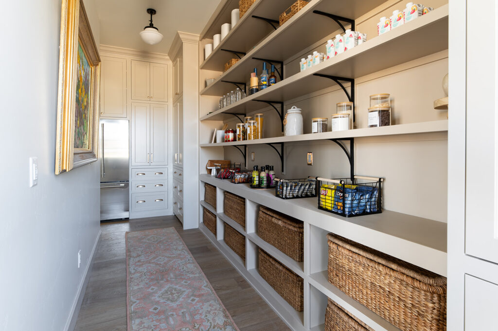
What makes Shiitake so compelling is its’ balance. It doesn’t lean too pink or too yellow, and it resists the flatness some neutrals can fall into. Instead, it adds gentle depth and warmth, wrapping the space in a sense of calm and understated elegance. In this pantry, surrounded by beautiful cabinetry and thoughtful details, it brings cohesion and softness without distracting from the function of the space.
Pairing this paint with warm wood, mixed metals, or organic textures enhances the stone-gray quality of the color, while keeping the overall look elevated and livable. It’s one of those rare tones that adapts effortlessly to its surroundings—exactly what we wanted for this transitional space between the kitchen and the rest of the home.
Shiitake is more than just a neutral—it’s a character-builder. And in this butler’s pantry, it’s playing a quietly powerful role, proving why it deserves the spot on any list of the best interior paint colors.

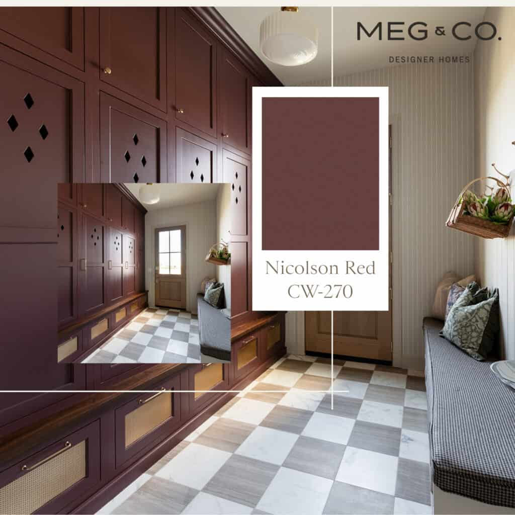
4. Nicolson Red Benjamin Moore: Mudroom, Reimagined
In our Charles Project mudroom, we took a bold leap with color—and it absolutely paid off. We chose Nicolson Red (CW-270) by Benjamin Moore, a rich, earthy crimson originally found on colonial homes throughout Williamsburg in the 18th century. While deeply rooted in tradition, this shade feels anything but dated here.
Set against a backdrop of checkered tile flooring, vertical paneling, and a statement light fixture, Nicolson Red brings a level of warmth and drama that instantly elevates the space. The cabinetry, finished in this deep wine-toned red, features diamond cutout details and brass hardware that nod to classic design, while the color itself brings undeniable richness and character.

This shade is more than just a red—it’s a feeling. It grounds the room with its intensity, yet feels sophisticated and welcoming rather than overpowering. The tone shifts beautifully with the light throughout the day, and it works effortlessly alongside neutral tones, natural wood, and gold accents.
It’s hard to even call this just a “mudroom” anymore—Nicolson Red transformed it into a space with presence and story. It’s where function meets beauty, where tradition gets a fresh perspective, and where every design detail feels considered and full of intention.
If you’re looking to make a strong yet elegant statement, this is the red that doesn’t shout—it speaks.
5. Dreamy Laundry Room: Oil Cloth by Benjamin Moore
Laundry rooms are often overlooked when it comes to intentional color—but not in our Charles Project. For this charming and highly functional space, we selected Oil Cloth by Benjamin Moore, a soft and muted green-gray that brings warmth and refinement to an otherwise utilitarian room.
Inspired by the timeless durability and vintage charm of its namesake, Oil Cloth offers a great blend of green with a hint of gray and blue, creating a hue that feels both fresh and grounded. It’s more refined than a true sage, and cooler than traditional “muddy” greens.
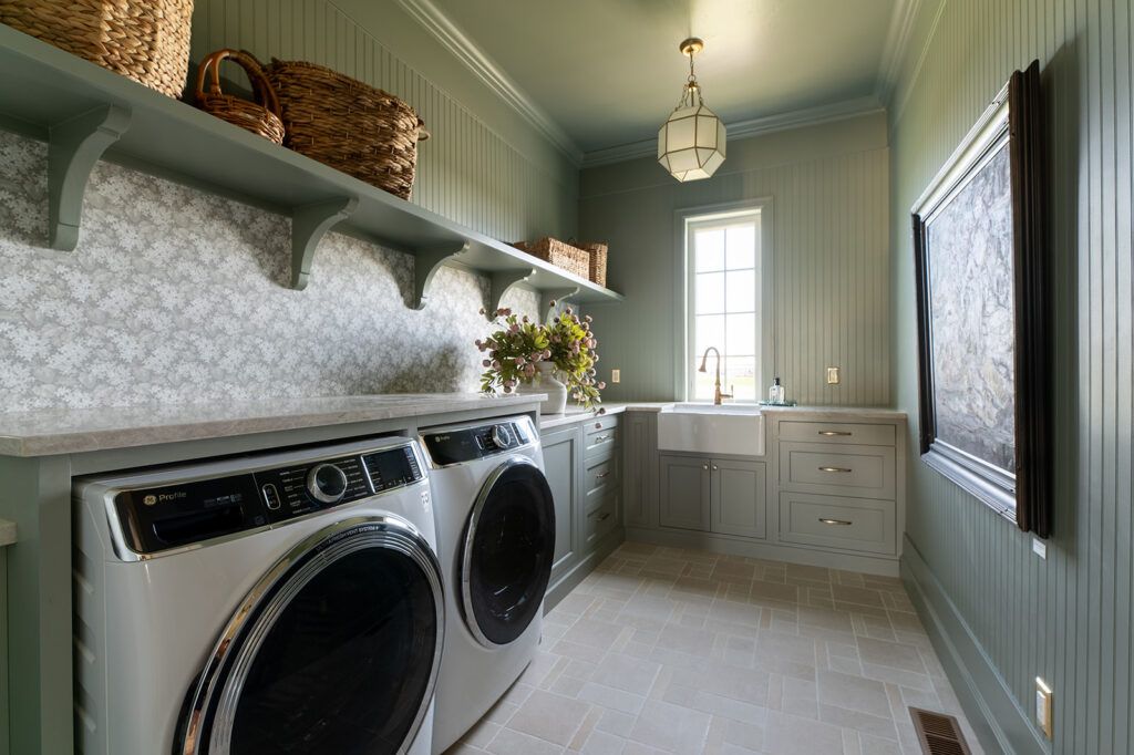
We used this color throughout the room—from the cabinetry to walls and even the ceiling. Open shelving, a farmhouse sink, and a cube-shaped frame lantern light fixture complete the look, balancing old-world charm with modern utility.
Compared to similar tones like Farrow & Ball’s Pigeon, Oil Cloth is just a touch cooler and lighter, making it a great choice for those who want a green that feels tranquil without being too earthy or dark. It pairs effortlessly with warm whites like Simply White or White Dove, both of which complement its subtle gray undertones well.
This laundry room proves that functional spaces can still have personality—and with a color like Oil Cloth, that personality is soft and serene.

6. Guest Bathroom: Bateau Brown by Sherwin Williams
We embraced drama and warmth with Bateau Brown (SW 6033) by Sherwin-Williams in this guest bathroom at Charles Project. It is deep, moody and unexpectedly elegant. The vertical wood paneling, fully painted in this luxurious tone, creates a cocoon-like effect that instantly elevates the room.
Bateau Brown is a truly unique color. While technically a rich brown, it carries subtle reddish and mauve undertones, giving it a soft, almost velvety depth that feels both earthy and refined. It’s the kind of shade that changes beautifully with the light—reading deeper and more dramatic in the evening, and slightly softer by day.
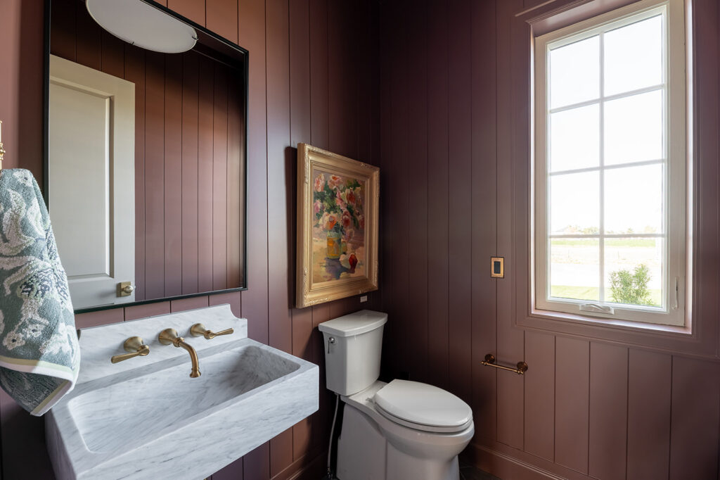
This bathroom pairs Bateau Brown with gold fixtures and a striking painting in a gold frame. These thoughtful details emphasize its warmth and sophistication. The overall effect is cozy, memorable and full of character—a true guest retreat.
Whether you’re designing a powder room or an entire primary suite, Bateau Brown is a bold yet graceful choice. It anchors a space with depth and emotion, all while allowing design details like art and metals to truly shine.

Whether you lean bold and dramatic or prefer a soft, neutral palette, color has the power to transform a home—and we hope this glimpse into the Charles Project sparked some fresh ideas and inspiration for your own space. Every shade tells a story, and the right combination can bring both beauty and balance to your everyday life.
At Meg & Co, we believe great design starts with thoughtful choices and a clear vision. If you’re ready to begin crafting a home that feels personal, inviting, and built to last, we’d love to be a part of the journey.
Book A Consultation
Let's get to know each other. Contact us through our client inquiry form! We'd love to talk with you about your custom home project and get to know you better.
During an initial consultation, we will discuss the priorities you have for your home, your planned investment, and your personal style.
Book Now
More Posts

Meet Our Team: Mandy Hodges, Lead Designer & COO
Types of Chandeliers In Your Home

Top Front Door Styles and Types for Your Custom Home
